You’re a savvy business owner who knows that it’s imperative to market both digitally and in print. Perhaps you have advertising campaigns you want to run in both spaces. That’s smart, good for you! Just remember that designing for digital or web is slightly different than designing for print. Make sure you (or your designer) are familiar with these fundamental principles of print design.
CMYK vs. RGB
RGB color values are based on light. Red, green, and blue colors are mixed together with light to create a wide variety of digital colors. There is no technology (yet!) that allows us to print with light, so printers use the CMYK color space. CMYK color values are based on the mixing of inks: cyan, magenta, yellow, and black. Make sure to select the CMYK color mode in your program (Photoshop, Illustrator, etc.) when creating your artwork. And, if possible, consult a physical CMYK color chart or Pantone swatch book to make your color decisions.
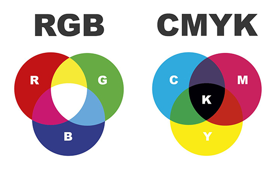
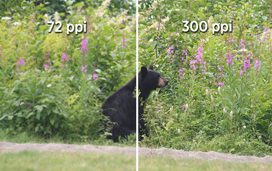
Image Resolution
One of the most common mistakes people make is finding a really cool image on the web and wanting to put it in their printed piece. Most web images are low resolution, around 72 ppi (pixels per inch). This is too low for printing—images at this resolution will look fuzzy or blurry. Your image needs to be at least 300 ppi at your desired size. One of the best ways to ensure a high quality photo is to search stock image websites and purchase the one (or ones) you need.
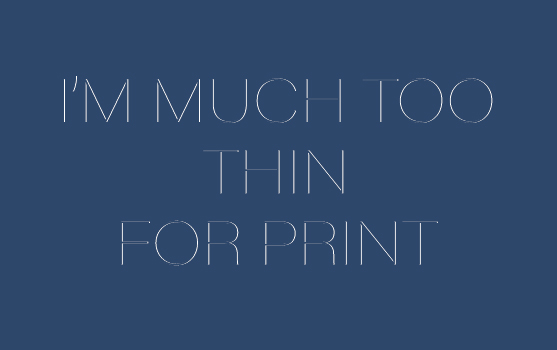
Font Size & Weight
Perhaps you have a very modern design with thin sans serif fonts or small text. Depending on the background of the type and the printing technique you are using, those very small or very thin characters might not be legible when printed. This is also true of fine hairlines. And if you use small text on a rich black background, any slight misalignment of printing plates might make your characters illegible. When you have white text over black, use a C0-M0-Y0-K100 simple black to avoid any possible blurring. And as general a rule of thumb, any type you want to be legible should be 6pt in size or larger.
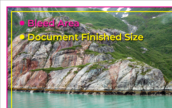
Bleeds
Does your design incorporate color or images that go all the way to the edge of the paper? If so, your design needs a bleed. The bleed area is an outer margin that you set around your document borders. Graphics or colors that reach the edge of the page need to be extended to the bleed limit. After your piece is printed, the bleed area will be trimmed down to the desired document size. Thanks to the bleed, you won’t have any unwanted white border appearing along the edges of the artwork.
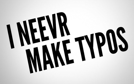
Proofread
Now you’ve printed 50,000 of your beautiful flyers and the first thing you notice when you see them is that there’s a huge, glaring typo. How did you not notice it before? While a misspelling might be no big deal to correct on a Facebook post or blog entry, it’s a different story with a printed piece. Enlist the help of a colleague or friend (or even spellcheck) to take a quick look at your design before you give the final go ahead for print. You’ll thank yourself later.
These efforts can be minor to make, but are incredibly important to creating a beautiful finished product. Understanding the differences required for producing designs for print vs web will help prevent confusion and keep your advertising and marketing materials looking their best. James Litho is ready to help your products come to life—give us a call today!